The yearly cycle of smartphone software updates is once again underway. Apple has just announced that its yearly developer conference WWDC, where iOS 13 is set to be unveiled, will take place at the start of June but Google is one step ahead.
The first beta of Android Q was pushed to developers and early adopters in March and since then another two versions of the operating system have been made available. We've been testing out the latest software of Q on a Pixel 3 XL.
At this stage, it's still early days for Android Q but there's one addition that's going to change everything – and please die-hard operating system fans. It's dark mode.
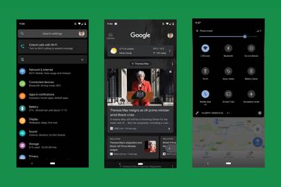
For the first time Google has decided to introduce a system-wide dark theme. Instead of menus being white with black text sitting on top, the colours have been inverted. And it's beautiful. Google's designers have clearly spent time thinking about how the dark mode should look and feel.
Instead of a straightforward inversion of colours the design changes are more subtle. Swipe down from the top of your phone's screen and the settings tray is a mixture of white, grey and blue icons on the black background. If you dive deeper into settings menu, each icon (battery, display, sound etc) has been given its own colour. They all pop against the black background and the text that accompanies them alters between white headings and a grey subheading.
The attention to detail in Android's dark mode is what makes it satisfying to use. Both the app selection menu and Google's Now feed, which is a swipe right from the home screen, are predominantly black but also use muted levels of transparency. The effect is polished and gives the dark mode a fresh feel, despite its introduction being half a decade too late.
As well as the execution, dark mode is also an improvement because of its potential impact on your vision. Navigating Android in dark mode, particularly with the larger sized phone screens that are used now, feels as if there is less strain being placed on tired eyes. The science on this is currently debateable but anecdotally I perceive it to be better.
The dark theme isn't perfect though. It's far from it. At the moment the limited development of the overall Android Q beta means the dark theme isn't universal. The UI, menus and settings are some of the few on-device displays that have been treated to the black, white and blue mode at the moment. But by the time Q is given a name and made public this Autumn there'll be more capability.
Google has just released dark modes for Google Calendar and Keep, a note taking app. Turning dark mode on in Android Q's settings will automatically turn the Google apps dark. There are plans to let third-party app developers automate dark modes for their own apps too. The Android guidance that's been issued for developers says the dark mode can reduce power usage on a phone or tablet and improves visibility for low vision device users.
To encourage devs to support dark mode Google is introducing a Force Dark option. "Force Dark analyses each view of your light-themed app, and applies a dark theme automatically before it is drawn to the screen," Google says on its developer blog. "Some developers use a mix of Force Dark and native implementation to cut down on the amount of time needed to implement Dark theme."
Despite the curent restricted nature of dark mode it's one of the most significant changes Google has thrown into Android for several years. Android Pie, the current iteration of the operating system, was largely a performance and stability update. (Google did flex its AI-muscle and added some personalisation features.) Android Oreo before it had some barely noticeable battery improvements and notification control changes.
They're all useful features but aren't exactly exciting. Dark mode on Android Q is core to the user experience. If you turn it on, you can't miss it. The light text on a dark background smacks you in the face and if you haven't joined the dark mode revolution, it's good enough to convert you.
But what about the rest of Android Q? The operating system on my Pixel feels like it runs more smoothly and transitions between menus and apps are slightly quicker. Google has given the gesture navigation it introduced last year in Pie an overhaul. The back button is slowly being phased out and when you swipe in either direction across the tablet-shaped button at the bottom of the screen it will take you forward or backwards among the most recently opened apps. It works much in the same way as iPhone navigation does.
And speaking of artificial intelligence additions there's one in Android Q that will make your phone-based life more productive. Now when a notification appears on your device, Google will provide a suggested action.
My experiences of these so far have mostly been limited to messages but they are proving to be useful. When my partner messaged me a link to an article to read, the notification gave an option to open the link in Chrome with one tap. When I was sent an address for a coffee shop meeting, it could be instantly opened in Google Maps. It's a neat touch that once you've used a few times will become something you notice isn't there on other pieces of tech.
There's other new additions to Q – a focus mode, enhanced privacy settings and 5G compatibility – but none of these are dark mode. That's the first thing you should try once you install Android Q.
More great stories from WIRED
– Why parents should stop worrying about videogame addiction
– Why are we having less sex? Blame honesty
– Jeff Bezos wants to colonise space, but he's destroying Earth
– Why staff on the autism spectrum are a huge asset
– Why Tim Cook is a better Apple CEO than Steve Jobs
https://www.wired.co.uk/article/android-q-review-dark-mode
2019-05-25 05:02:56Z
52780303032496
Tidak ada komentar:
Posting Komentar