Photoshop turns 30 years old today, and in honor of this most feared of millennial milestones, Adobe has released a major update for Photoshop on both the desktop and the iPad, improving some of the most-used and important features on both platforms: Content Aware Fill and Object Selection.
As usual, the updates were detailed in a post published moments ago on the Adobe blog by Photoshop’s Product Manager Pam Clark, and there’s quite a bit to unpack.
Photoshop on Desktop
OG Photoshop—the kind you use on your computer—is getting two major feature improvements, a minor update to the UI, and a performance boost today.
The Content Aware Fill is getting yet another upgrade, the Lens Blur filter is getting a quality and performance boost, “Dark Mode” is now supported on Mac, and you should notice some “key performance improvements” when panning and zooming around a canvas.
Content Aware Fill Improvements
The biggest feature improvement to Photoshop on desktop comes to the Content Aware Fill tool. Specifically the workspace, where you can now “Apply” multiple fills and iterate as many times as you want before you click OK and accept your results.
This improvement comes straight from customer-feedback, according to Adobe.
“One of your top requests was to stay in the workspace to refine fills that need multiple CAF iterations—imagine removing something from behind many tree branches, or other tricky scenes with visual diversity,” explains Clark “To do that, we now enable you to break the fill region into sub-parts to give you more iterative control to achieve a more realistic fill.”
You can still use the standard automatic Content Aware Fill feature under Edit > Fill, but the workspace is getting to be much, much more usable thanks to updates like this.
Lens Blur Improvements
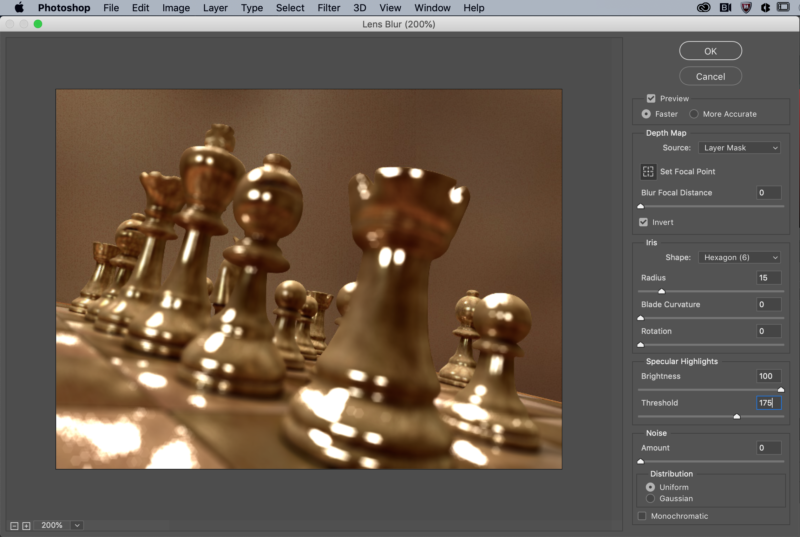
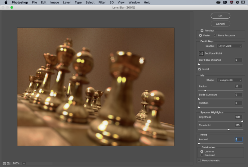
Today’s update allegedly improved the Lens Blur filter in a big way by moving this process over to the GPU from the CPU. This should improve both the output quality and performance of the tool moving forward, thanks in part to the “more colorful bokeh via the specular highlights.”
The highlights in particular are very obvious in the before and after below:


“The results are created by an algorithm the team built by studying the first principles of physics and how light interacts with objects in the real world,” explains Adobe. “It is carefully tuned to simulate a 3D environment to create the most realistic results possible, while also consuming the least amount of compute power so you don’t burn up your machine.”
As simulated bokeh on smartphones gets better and better, it makes sense that Adobe would want Photoshop to keep up.
Dark Mode Support
This one’s pretty self-explanatory. Users of macOS who prefer to use the “Dark Mode” UI will get the same experience across Photoshop as well. No more bright silver “Save As” or “Open” dialog boxes.
Performance Improvements
Every update to Photoshop or Lightroom comes with mysterious “performance improvements” that are usually talked about in pretty vague terms. This isn’t an exception.
Today’s update allegedly makes your experience of Photoshop much smoother, specifically as it applies to “clicking interactions” like using the hand tool to move around a canvas. The bigger the document you’re working on, the more noticeable the improvement should be.
Photoshop on iPad
After promising that they would not leave Photoshop for iPad to languish after its initial release (like they have with Premiere Rush…), Adobe is delivering on that promise today with the first of “a continuous stream” of feature updates that the company has planned for the tablet version of the app.
Thanks to the fact that Photoshop on iPad is built on the same code base as Photoshop on the desktop, Clark says that Adobe is able to “add new features with deep and rich capabilities and high quality output that matches that of the desktop very quickly.” Hopefully this trend continues.
Today’s update includes two feature additions: Object Selection and Type Setting.
Object Selection Tool
Object Selection, first debuted for the desktop at Adobe MAX 2019, is making its way to the iPad with the same functions, options and settings you’re already used to.
Unlike Subject Selection—which was added to the iPad in December—Object Selection is better suited for images where there are multiple objects to choose between or only a part of something or somebody that you want to select.
The example below was done using both the options on iPad. This is the base image:
First, Clark isolated the woman in this image using a rough lasso selection:
Then she used the same technique to select the background subject’s glasses and guitar (which was probably done in two parts):
“The Object Selection tool is designed to give you speed, but also more control over the selection process on more complex images,” explains Clark. “[The selection above] was super easy and I had what I wanted in just a few seconds.”
To see the new tool in action, check out the video at the top of this section.
Type Setting
More relevant for designers than photographers, this is still a notable addition. With the exception of kerning, many of the typesetting features from the desktop are now available on the iPad. This includes: “tracking, leading, scaling, and formatting things like all/small caps, super/subscript.”
All of these updates are live as of this morning, so if you’re a Creative Cloud subscriber you can simply update your apps on both desktop and iPad to try out the features above. If you want to learn more about these updates, head over to the Adobe blog for more details.
https://news.google.com/__i/rss/rd/articles/CBMiW2h0dHBzOi8vcGV0YXBpeGVsLmNvbS8yMDIwLzAyLzE5L2Fkb2JlLXVudmVpbHMtbWFqb3ItcGhvdG9zaG9wLXVwZGF0ZS1mb3ItZGVza3RvcC1hbmQtaXBhZC_SAQA?oc=5
2020-02-19 14:01:00Z
52780620928219
Tidak ada komentar:
Posting Komentar